
The music video "It doesn't hurt" of Angela Chang, a Chinese singer, makes me feel so good. The music is very nice, but it's not what I wanna mention later :p Since I really these kind of abstract video like this, so at the 1st time, I watched it, I fell for it :p
There are many interesting things in this video: the make-up, the lighting, the dress, the combination between the music and the images, etc. As you can see at the beginning of the video, there are several images appearing and they fit with the music perfectly. Besides that, the lighting of this video is very awesome. There is always a right amount of lighting in each and every scene. For the scene that she's in the forest, the lighting reminds me of something evil and weird. It's not too scary, but kind of mysterious. Moreover, she doesn't make-up too much in those scene. While other scenes, such as in the hall or the close-up of her face, there is more make-up, but the face still looks very pure. And I think the make-up plays an important role to stress her beautiful features on the camera. Next, the way the crew chose the dresses for her is also good. Each scene she has a different dress and each one create a different but meaningful mood. The concept is abstract, so no one can say exactly what is going on in this video. However, due to its abstraction, the video is much more special than other typically linear music video.
Saturday, May 19, 2007
Poster for Mar Group
Hee-haw, that is my poster done for Mar Group of Economic University :D Actually one of my old friend, Tram, asked me to make a poster for their new workshop, of which name is "Sếp của thời gian" (which totally means "The boss of the time" in English). This workshop will help students manage their time successfully to reach their achievements. At that time, I was kind of lazy because I had a lot of assignments to do, but it seemed that there was nobody that could help them, so I had to :-s
As you can see, there is something looking like a small target, which represents the goals that you wanna fulfill in your life in this case. Besides that, the triangle seems like a dart as well as a sand-glass. So it means you're trying to control the time to complete your goal on-time and successfully. I don't know why I chose green as the background's color, but it's suitable for the whole theme, isn't it? :p Inside the triangle is the name of the workshop, "The boss of the time". Other big texts are its main points of the workshop, "A series of skills for life" and "Skills of managing time". I put them next to the triangle to stress it more and make the structure clearer.
I just wanna create somethings extremely simple for this kind of poster like this. But the "client" forced me to stuff it with a lot of information. Through this experience, I can see that it's not easy to be a designer. You have to depend on what your client likes and wants. Anyway, it's a very nice experience for me.
Thursday, May 17, 2007
Converse website
The Converse website is used to promote many shoe styles of Converse corporation.
What I really like is the loading page icon, that is a shoe. Depending on which page is loading, the shoe will show different states, for example changing the color of the shoe over and over again. Though it's very cute to have something like this, I think Converse can help users predict the response time in downloading by showing the size of the download next to the shoe.

 It is very useful when there always is additional information about the link. Whenever users is moving the mouse over the link, the link is change into the information explaining what the link really means. I think it's good to help new users interact more accurately and effectively. By doing this, Converse has shown respect to supporting users’ navigation behavior.
Another thing that I really like is the sound effects (actually I always like websites offering audio feedbacks to users). Though the designers just use one sound effect to illustrate the states of various kinds of button, it's kind of nice to let users know they've successfully pressed a button.
A successful point of this website is the well-designed main navigation. Whenever users move over it, the options appear actively and strongly, which fits the main theme of such a site promoting shoes for teenagers like that. Besides that, if the mouse is out of the specific area, these options automatically become their original states smoothly. Moreover, before coming to their positions, these buttons rock themselves to and fro. Though this kind of movement is very simple, it shows the extremely careful observation of the designers.
 As Converse is the type of stylish shoes for young people and who wanna show off :p so the background needs to be powerful to fit with other elements such as the navigation, the loading icon, etc. I have to admit the background is quite messy, but due to its confusion, an extreme stylish, strong and modern mood can be built stably and lively. Moreover, the background is filled with the images of good-looking and healthy models wearing Converse shoes, giving a modern and stable look for the whole site. It also makes the site different from other simple sites. It's surely "Less is More", but sometimes "More is More".
Friday, May 11, 2007
Books recommended for final project
I've read these 2 books and found that they're extremely interesting and useful for the final project of Don.
1. Visual Creativity: written by Mario Pticken. This book, with 817 illustrations and 794 of them in color, is intended for creatives in the following fields: advertising and marketing, photography, game design and development, cartoons and non-stop animation, new media, architecture, etc. I think by reading this book, you can strengthen your imaginary skills as well as be able to use these skills to develop your own stories and sequences.
 2. >on screen> in time: transitions in motion graphic design for film, television and new media: written by Melanie Goux and James A.Houff. The transitions, images and text changing from one to another over time, play a big role in motion graphic design. This book offers audiences more refined and thoughtful transitions and why the artists in this book chose these kinds of transitions. Through interviews and images, readers can explore the life and work of 16 highly regarded motion graphic designers.
Tuesday, May 8, 2007
A sunny day in countryside
The song is created based on the idea of a sheep walking around his farm and feeling so good and he's trying to find some sunflowers for that beautiful day. Actually, it almost fits what I was thinking in my mind. Funky and funny rhythms play on a countryside atmosphere. I think the title "A sunny day in countryside" is suitable for the song, do you think so?
Let's enjoy it!
Let's enjoy it!
Friday, May 4, 2007
Escape from Love
That is the name for the song I've made lately. Actually, I just wanted to create something funky and noisy in Garage Band, then the song was born suddenly when I combined and overlapped several audio clips. The name "Escape from Love"was inspired from the song "L.O.V.E" of Ashlee Simpson, as the rhythm of both songs are totally funky and strong, which may make audiences feel like swinging their body and dancing.
I did not finish it yet, since I'm still thinking about its ending part. However, this short song sounds kind of nice, so I post it here to get your comments.
I did not finish it yet, since I'm still thinking about its ending part. However, this short song sounds kind of nice, so I post it here to get your comments.
Wednesday, May 2, 2007
Spore website

Spore is a website of Will Wright, the creator of The Sims. It was created to promote an online game, in which there are several phases through the development of civilization and technology. There are also a series of characters, based on each period of phase. I think the idea is based on the development of human being, as you can see, each phase is designed according to a specific point of time in human history.

 Some screenshots of creatures
 Some screenshots of The Space Phases
Friday, April 27, 2007
"Two faced" book
In my opinion, "Two faced" collected by Darren Firth of Wearitwithpride is an extreme outstanding and brilliant book for our ILC collection :D
 It's a portrait project where the artists were paired off and made a portrait of each other. They can use their own style freely since there's no strict rule for the creation. The artworks can be abstract or photography, drawn by hand or done by computer, etc. One interesting thing is the invited artists are the most talented and influential creative people of the last decade around the world. For example: Warren Holder, Nicc Balce, Nathan Jurevicius, Jon Burgerman,Tado, and Audrey Kawasaki, and so on.
Some of the artworks:

 ** You can visit the website for more info: Two faced
"Jojo in the stars"
That's one of my favorite animated movies ever. It is a film done by Marc Craste, who is an animation director at Studio AKA in London. JoJo in the Stars is a story of love, self-sacrifice and jealousy played out against a black and white world. JoJo herself is a silver-plated trapeze artist, who was imprisoned by bad guys. Then a hero came to her life and rescued her; however, the bad guys recognized it early and tried to chase them. While escaping, the hero almost cost his life and had to become handicapped forever.
All the characters were created in CGI, using Softimage XSI and After Effects for postproduction. It emphasizes on the black and white atmosphere associated with dramatic lighting and computer-generated images. With almost no dialogue, audiences will be surprised by how much they would be into it, though firstly they'd just think of it as a very dark and bittersweet tale. And just because the story is very visual and easy to understand; in my opinion, the dialogue is not essential at all and will make the audiences feel distracting somehow. In addition, I think the background music is also done its best job to make the animation more impressive and brilliant, the story more memorable and the black and white atmosphere more interesting and expressive.

Awards
- BAFTA 2004 ~ Best Short Animated Film.
- Clermont Ferrand 2004 ~ Prix Du Meilleur Film D’animation
- Aspen Short Film Festival 2004 ~ Special Jury Prize
- International 3D Awards Copenhagen ~ Best Short Film
- Animasia SICAF 2004 ~ Short Film Grand Prize
- Bradford Animation Festival 2004 ~ Grand Prix
- Brief Encounters Festival 2004 ~ Best of British
** The movie in Youtube is just about 0:37 minute, while the real one is about 13 mins. So I think it'd better not upload it here since it can be a spoiler. But I recommend you go to: www.veoh.com and download it! It's totally free!
Saturday, April 21, 2007
Graffiti- Art or Design?
Graffiti are usually large pieces of images or letter drawn on a publicly interface, such as a wall or a train. Graffiti artists use spray paint, markers, or other materials to make their artworks. Some artworks can be considered as vandalism because of breaking the law.
 I, myself, think that graffiti is both art and design, it's just up to the usage purpose and the legality.
A graffiti work can be an art:
- because it has been founded, maintained and developed a lot since since the day of ancient civilizations such as Ancient Greece and Roman Empire
- when people make it to express their own point of view, not for any public purposes or involved in clients and money
 A Graffiti piece of Dove
A graffiti is considered as a design:
- when it communicates messages to audiences and creates some useful and thoughtful meanings such as society and politics
- when it is used as a form of advertising
- there are lot of things that is decorated with Graffiti such as fonts, T-shirts, shoes, etc
*Note: those're just my points of view, so there's no right or wrong :D

Well, about Vietnamese visual theme for Graffiti art, I think that'd would be a very nice idea. However, Graffiti styles tend to be more Western, the artworks seem to be more intense, strong, bold, hard and rough. On the other hand, Vietnamese visual themes are more tender, soft with curves and thin lines. Besides that, many people in Vietnam, especially elder and mature people, still consider Graffiti as a bad thing, vandalism or illegal stuff just for bad and low-educated young guys. Therefore, it's hard and will takes time to make Vietnamese people accept it as an art and apply it into their normal life such as paper-hangings, clothes, etc. If Vietnamese Graffiti artists can combine these two different things together, it'd be interesting and may build up a new special style for Graffiti in the future.
Friday, April 20, 2007
"Don't Click It" website

http://www.dontclick.it/
I've found this website and I think it's very cool and interesting. What I really like in this website is the smooth animation and the quick interaction. Besides that, it's also because we don't need to click to navigate, just move the mouse over the "buttons" or the navigation and things will happen normally. There are also the history of clicking and some experiments for users to check their "nature of clicking", as well as some online "training course" how to use moving mouse instead of clicking. Actually, I think that's a good thought of not overusing clicking. However, when navigating this website, I do "miss" the clicking a lot =.= moreover, since the interaction between users and the interface within the mouse-overs, it's impossible to do something else while waiting for something loading in this website. As whenever we move the mouse, the interaction has been changed into something else. Therefore, it's kind of disturbing and annoying for users to wait and just interact within this website once they've opened it.
Saturday, April 14, 2007
Clermont-Ferrand Film Festival

The Clermont-Ferrand Film Festival has become the most important cinema event in the world devoted to short films. In this post, I'll write about this film festival to make people understand more about it and may get involved in this kind of festival.
A. Introduction:
-
- It has been considered as the most important cinema event in the world dedicated to short films. The great numbers of audience and the professionals’ attendance every year make this the second film festival in

some movies in this festival
B. History:
- Sauve qui peut le court métrage (roughly translatable as "Short Film: S.O.S!") association created and organized The Clermont-Ferrand International Short Film Festival in 1979 due to the lack of a major event around short films. However, at that time, only the National Competition was presented.
- Until 1989, the first International Festival was celebrated, contributing to launch it as the major international cinematographic event for short films.
- In 1997, The Auvergne Film Commission was created to help the film crews improve their work and provide them with information on local resources, services and professionals.
- Lately, in 2002, a new competition devoted to digital works has been created.
* The 1st reason is the festival every year has presented around 400 fiction and animated films, documentaries and experimental films, which together represent the rich diversity of contemporary cinema.
* Another advantage that

exhibition hall
- Besides that, all the films and their useful information are referenced in the market catalogue which is bilingual (French & English). Three versions are available: the online version, available from our website through the Pro Services; the interactive version, available at the video library; and lastly, the hardback edition which is on sale.
- Moreover, it provides access to a video library. All the films submitted to the Festival are stored on a server and available for viewing on 35 video units.
- Lastly, the Pro Services will help users fully enjoy all the facilities the Short Film Market has to offer. It means you can easily access to the video library, browse through the online version of the Market Catalogue and fully approach the enriched version of the Festival’s backlog database (information on films, sales and production contacts).

Pro Services online
Reference:
- Clermont-Ferrand Film Festival website, http://www.clermont-filmfest.com, viewed on
- Clermont-Ferrand Film Festival 2003, British Council Arts, http://www.britishcouncil.org/arts-film-clermont-ferrand-festival-2003.htm, viewed on
- Clermont-Ferrand Film Festival 2004, British Council Arts, http://www.britishcouncil.org/arts-film-clermontferrand2004.htm, viewed on
- Clermont-Ferrand Film Festival 2005, British Council Arts, http://www.britishcouncil.org/arts-film-festivals-clermontferrand2005.htm, viewed on
- Clermont-Ferrand Film Festival, IDMB website, http://www.imdb.com/Sections/Awards/Clermont-Ferrand_International_Short_Film_Festival/, viewed on
- Clermont-Ferrand Film Festival Review, BBC- Film Network, http://www.bbc.co.uk/dna/filmnetwork/A19039674, viewed on
- Best French Animated Films from Clermont-Ferrand Film Festival, Animateka 2006, http://www.animatekafestival.org/en/festival-2006/programme/special-programmes/best-of-clermont-ferrand, viewed on
- International short film festival-
Chinese Days Festival
These are some photos that I took months ago, which are about the Chinese Days taken place in Ho Chi Minh city for several days. I took photos in both day and night. In the morning, I chose to capture some water-color paintings. These pictures are not good enough because of the reflection of the mirror frames. It's kind of hard to avoid this unpleasant thing.


In the evening, I took some enjoyable activities happening in this festival. As we can easily see, the lanterns were the most interesting and eye-catching things. I tried to capture many angles of many chains of lanterns. And I think the evening images are much better than what I shot in the morning ^^


In the evening, I took some enjoyable activities happening in this festival. As we can easily see, the lanterns were the most interesting and eye-catching things. I tried to capture many angles of many chains of lanterns. And I think the evening images are much better than what I shot in the morning ^^


Saturday, April 7, 2007
Pics that I took and some common problems
These pictures I took when hanging out with my family last weekend. All were edited in Photoshop since the colors hadn't been so good and the shapes hadn't been tough enough.
I like the second the best because it looks kind of beautiful, but I always feel very lonely and sad when looking at this. The colors are good and contrast enough, the sky and the branches are balanced as well. However, the two others don't satisfy me much, since I hoped they would get the better structure and lighting.
The 1st one was kind of dark, the details seemed to be very unclear. I had to adjust the brightness and the contrast option to make it brighter and clearer. However, the colors seem to be muted and the sun lights don't look real and clear enough. Besides that, the structure is not good enough, it doesn't follow the one-third rule. There are too much space for the bottom and too little space for the top. This makes the picture look weird and ridiculous.
The 3rd one is much brighter, but the problem was also the lighting. I forgot to turn off the flash, then I took this while it was mid day. Therefore what we just can see is the yellow shape of the flowers, not other elements such as the stamen and the petals.
These problems sound very typical, but it's really easy to cause them too. So I have to take care of the lighting as well as the structure for the next shooting.


"Father and Daughter"
The title of this 8 minute video, Father and Daughter, caught my attention. It's kind of simple, but there're tons and tons of things between a father and a daughter. So I watched it. And I was really touched by the style of animation, the music as well as the script.
The story is about a father and a daughter riding along the countryside. Then he says goodbye to his young daughter, and she couldn't find him for ages. Time passes by and she grows older and older. However, the love and the deep longing for her father are never faded.
What makes me really surprised is the style of this animated film, it's totally done in pencils, charcoal and a software called ANIMO. While many modern animated films tend to be drawn based on 3D and computers, this kind of animation reminds me of the old style animation in the 1920s, which may make the story more touching and memorable. Besides that, I think that's the best way to represent the beauty of Dutch countryside's sightseeing. Moreover, there is a really specific characteristic that is always used in Dutch animation; that's the "non-verbal" or "no-dialogue" effect. Therefore, audiences can only communicate with the movie through the background music, the gesture, and the movement of the characters, etc. Due to these special effects, "Father and Daughter" becomes much more special and embedded in viewers' memory.
"Father and Daughter is a film about longing, the kind of longing which quietly, yet totally, affects our lives” is what Michael Dudok de Wit said about his masterpiece.
Some scenes:


 Some other related information:
- Running Time: 8 minutes 30 seconds
- Year of Release: 2000
- Production: Cloudrunner Ltd, UK, and CineTe Filmproductie bv, Holland
- Script, Design and Animation: Michael Dudok de Wit
- Other Contributors: Normand Roger (Composer), Claire Jennings and Willem Thijssen (Producers), Arjan Wilschut (Main Co-Animator), Jean-Baptiste Roger (Sound), and Alistair Becket and Nic Gill (Technical Directors)
- Awards include:Independent Film Award, Ottawa International Animation Festival, 2000; Grand Prize, Cinanima Animation Festival, 2000; Grand Prix Narrative Films, Holland Animation Film Festival, 2000; and Best International Animated Film, Clermont-Ferrand Short Film Festival, 2001
Reference:
http://www.imdb.com/title/tt0279079/
http://www.awn.com/oscars01/animfather.php3
Saturday, March 31, 2007
The Art Nouveau design style of the 20th century VS. The Psychedelic design style of the 1960’s
Art nouveau design style:
It could be recognized to be the first new decorative style of the twentieth century and is described by 2 different styles of look. There are: elongated and curvy looks vs. plain and linear lines. However, this style of art always have such as birds, flowers and insects but also include women and fantasy creatures, etc as its main keys of style. Therefore, that's why it's used most in decoration and architecture.
Art Nouveau is said to response the Industrial Revolution since while new materials and technologies are used, it stressed on handcrafting instead of machine manufacture.
 Poster by Alfons Mucha
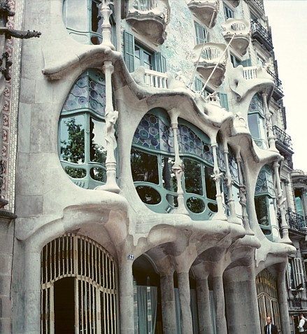
 Casa Batllo in Barcelona, Spain, designed by Antonio Gaudi
 An Art Nouveau architecture
 Urbanc house, Ljubljana
Psychedelic design style:
It is an art style inspired by the prevalence of hallucinatory drugs, especially LSD, with typical designs featuring abstract swirls of intense colors. There are a great number of things that always stick with this kind of art: bright and highly contrast colors, repetition of motifs, fractal patterns, and so on. Besides that, psychedelic art is composed of music, drugs, art, literature and hippie activities. They all turned into an outstanding combination of fine art and commercial art technique.
 Wes Wilson and Psychedelic Art
By Fiona Clark
 Oversoul by Alex Grey
 Psychedelic guitar design
Personally, I think Art Nouveau and Psychedelic Art are similar at some points such as shapes, lines, curves, etc. However, colors used in Art Nouveau is much more muted but comfortable for our eyes to look at, while Psychedelic Art artists tend to use highly contrast colors to present their ideas. Moreover, there always has abstract swirls of intense colors and exotic patterns in Psychedelic artworks. On the other hand, Art Nouveau uses typical flat decorative patterns, combined with organic forms or floral graphics. Besides that, Art Nouveau designers like to use formal and antique fonts, while in Psychedelic Art, complex and graphics fonts are more popular.
http://en.wikipedia.org/wiki/Image:F_Champenois_Imprimeur_Editeur.mucha.jpg
http://www.bluffton.edu/~sullivanm/spain/barcelona/gaudibatllo/facdet2.jpg
http://html.rincondelvago.com/files/8/7/8/000188780.jpg
http://commons.wikimedia.org/wiki/Image:UrbancevaHisa-Ljubljana.JPG
http://en.wikipedia.org/wiki/Art_Nouveau
http://www.bbc.co.uk/homes/design/period_artnouveau.shtml
http://en.wikipedia.org/wiki/Psychedelic_art
http://www.leahfaust.com/fausthaus_blog/wes_wilson.jpg
http://www.iamshaman.com/galleries/gray/images/image_01.jpg
http://www.cffguitars.com/psychedelicTOM.jpg
It could be recognized to be the first new decorative style of the twentieth century and is described by 2 different styles of look. There are: elongated and curvy looks vs. plain and linear lines. However, this style of art always have such as birds, flowers and insects but also include women and fantasy creatures, etc as its main keys of style. Therefore, that's why it's used most in decoration and architecture.
Art Nouveau is said to response the Industrial Revolution since while new materials and technologies are used, it stressed on handcrafting instead of machine manufacture.
 Casa Batllo in Barcelona, Spain, designed by Antonio Gaudi
 An Art Nouveau architecture
 Urbanc house, Ljubljana
Psychedelic design style:
It is an art style inspired by the prevalence of hallucinatory drugs, especially LSD, with typical designs featuring abstract swirls of intense colors. There are a great number of things that always stick with this kind of art: bright and highly contrast colors, repetition of motifs, fractal patterns, and so on. Besides that, psychedelic art is composed of music, drugs, art, literature and hippie activities. They all turned into an outstanding combination of fine art and commercial art technique.
 Wes Wilson and Psychedelic Art
By Fiona Clark
 Oversoul by Alex Grey
 Psychedelic guitar design
Personally, I think Art Nouveau and Psychedelic Art are similar at some points such as shapes, lines, curves, etc. However, colors used in Art Nouveau is much more muted but comfortable for our eyes to look at, while Psychedelic Art artists tend to use highly contrast colors to present their ideas. Moreover, there always has abstract swirls of intense colors and exotic patterns in Psychedelic artworks. On the other hand, Art Nouveau uses typical flat decorative patterns, combined with organic forms or floral graphics. Besides that, Art Nouveau designers like to use formal and antique fonts, while in Psychedelic Art, complex and graphics fonts are more popular.
Reference:
http://www.bluffton.edu/~sullivanm/spain/barcelona/gaudibatllo/facdet2.jpg
http://html.rincondelvago.com/files/8/7/8/000188780.jpg
http://commons.wikimedia.org/wiki/Image:UrbancevaHisa-Ljubljana.JPG
http://en.wikipedia.org/wiki/Art_Nouveau
http://www.bbc.co.uk/homes/design/period_artnouveau.shtml
http://en.wikipedia.org/wiki/Psychedelic_art
http://www.leahfaust.com/fausthaus_blog/wes_wilson.jpg
http://www.iamshaman.com/galleries/gray/images/image_01.jpg
http://www.cffguitars.com/psychedelicTOM.jpg
Don Ed Hardy-- Tattoo
Actually I've been fond of Don Ed Hardy and his style for years, but I hadn't not bought any pair of his shoes or clothes until now. Don is a real tattoo artist for his American, Japanese, Cholo, tattoo, surf and hotrod iconography.
 Don Ed Hardy was born in Costa Mesa, California, in 1945. He spent most of his childhood playing with tattoo and stuff. After that, in the 1960's, Hardy attended printmaking program at the San Francisco Art Institute and then opened his own tattoo shop named Dragon Tattoo. However, the shop seemed not to work well, so it was soon closed after 1 year. In 1973, he came to Japan and researched Irezumi, Japanese tattoo, carefully and enthusiastically. After many unsuccessful years, he turned to be very famous at San Fran tattoo style. In 2000, he was awarded an Honorary Doctorate by the San Francisco Art Institute. In November of 2006 Hardy and Andrew Sutton founded their own FDA Certified temporary tattoos following his design artworks.
I think Don Ed Hardy's style is very special and unique since it's the combination between American and Japanese hotrod imagery. His designs are not only good at graphics, but also have their own depth and meaning. In my opinion, he's turned his tattoo artworks into a kind of art before tattoo became a really popular culture like today. Most of his works are drawn with bright colors and simple graphics such as the skull, the tiger, the beauty, the fish, etc; however, we can see everything is done truly uniquely and creatively. And actually Hardy's work moves away from traditional tattoo forms to try more new graphics, colors, materials, textures, so and on. That makes his works extremely well-known and special.
Here are some of his works:


_resize.jpg) (I have just bought this pair of shoes ^^)
(I have just bought this pair of shoes ^^)
 Don Ed Hardy was born in Costa Mesa, California, in 1945. He spent most of his childhood playing with tattoo and stuff. After that, in the 1960's, Hardy attended printmaking program at the San Francisco Art Institute and then opened his own tattoo shop named Dragon Tattoo. However, the shop seemed not to work well, so it was soon closed after 1 year. In 1973, he came to Japan and researched Irezumi, Japanese tattoo, carefully and enthusiastically. After many unsuccessful years, he turned to be very famous at San Fran tattoo style. In 2000, he was awarded an Honorary Doctorate by the San Francisco Art Institute. In November of 2006 Hardy and Andrew Sutton founded their own FDA Certified temporary tattoos following his design artworks.
I think Don Ed Hardy's style is very special and unique since it's the combination between American and Japanese hotrod imagery. His designs are not only good at graphics, but also have their own depth and meaning. In my opinion, he's turned his tattoo artworks into a kind of art before tattoo became a really popular culture like today. Most of his works are drawn with bright colors and simple graphics such as the skull, the tiger, the beauty, the fish, etc; however, we can see everything is done truly uniquely and creatively. And actually Hardy's work moves away from traditional tattoo forms to try more new graphics, colors, materials, textures, so and on. That makes his works extremely well-known and special.
Here are some of his works:


_resize.jpg) (I have just bought this pair of shoes ^^)
(I have just bought this pair of shoes ^^)Saturday, March 24, 2007
HotMonkeyDesign website
HotMonkeyDesign
This website is kind of fun to explore. In my opinion, it's both informative and exploratory due to its experience design.
First, what I like best in this website is the music and the sound effect. It’s especially good to combine sounds with visual cues to help users know they've just moved the mouse over a button or something like that. I think HotMonkeyDesign makes strong use of sound in its interface. We can easily see that different buttons make different audio feedbacks, and the sounds are quite impressive, giving it an unique personality.
Another good experience that HotMonkeyDesign offer is it always gives a message to show how many percents have the user been loading and also some humorous sentences to make people feel less bored and impatient! I think that's a good point that every page needs to apply in their own site. Some sites takes me time to load but never shows where I am now, so sometimes I get bored and angry before visiting them.
 The next nice experience to me is the very perfectly smooth movement and design. After a minute of waiting, audiences can view a 30-second intro. The movement is fast and very smooth, which make users feel more interesting and curious. The design looks very clean and uncomplicated, but it requires extremely good skills of drawing on the computer and using Flash to do such an animation interface like that. It's easily seen that the graphics are very interesting to look at and the chosen colors are very harmonious with the main theme of the site.
 The navigation is very easy to use since the designers use the plain texts. Some buttons are disguised as small bubbles, giving users another chance to feel interesting and surprising after finding out this kind of button. The choice of typography is kind of plain, they just use san-serif for the whole site, but I think it's suitable for the whole theme as well as emphasizes other important things.
 Lastly, I like the animation always works in the background after we finish loading a page. The site seems to be "moving" while people are exploring it, then they'll be curious because they don't know what will happen next! In my opinion, this doesn't only draw audiences' attention, but also makes the site more special.
Subscribe to:
Posts (Atom)